How to draw a decorative black and white still life in many ways. Decorative still life
Like any other genre of photography, still life is impossible without composition. Moreover, still life is exactly the genre where the composition plays a primary role and requires the closest attention from the photographer. After all, a reportage frame can be forgiven a lot if the author caught a really good moment. And home pictures - have you noticed how mothers are touched when they see their child in a photograph, albeit a mediocre one? It is unlikely that we will wait for the same indulgence from the audience by photographing an orange with a bottle. To have a positive effect, you have to try. And, of course, you should start with the composition of the intended frame.
Relatively speaking, the composition in a still life is a harmonious combination and interaction of objects in the frame. Through composition, you can consistently show the viewer everything you wanted, create a mood, convey an idea, and even tell a story.
The composition in still life can be conditionally divided into several types:
- geometric
- spatial
- color
geometric composition
It is no secret that all objects have a geometric (or close to geometric) shape. It is also no secret that it is common for a person to associate each figure with something characteristic of her. So, for example, corners are subconsciously associated with pointers. When you look at a square or a rectangle for a long time, there is a feeling of stability (perhaps because our subconscious mind draws a stable building). And the circle creates a feeling of comfort and soothes. It is worth remembering that horizontal lines (a person lying down) are much calmer than vertical lines (a person standing). As for the diagonals, the ascending lines - leading from the lower left corner to the upper right - look more intense than the descending ones: we still read from left to right, and our eyes have to “climb” the picture to get to the very top. But there is a certain sense of victory hidden in this, isn't it?! Descending lines, going from the upper left corner to the lower right, on the contrary, are traditionally associated with relaxation, sadness, or even decline.
 |
 |
All these little tricks can and should be used for your own purposes - in order to convey the concept, the idea of the picture.
Space allocation

If there is a need to highlight a certain object in a still life, assigning it the role of the protagonist, here you can also play on a spatial composition. For example, put the main object in the foreground, in front of all the others. Or adjust the light so that the leading element is lit brightest, and those objects that are behind and in front of it are lit weaker. And you can do it smarter - light an incense stick or release cigarette smoke, thus drawing an aerial perspective in the frame: the main attention will be focused on the front objects, since the distant ones will drown in a romantic haze.

You can also play on the technical aspects of the camera: if you want to show every object in detail, including the backdrop or draperies, then shooting should be done with the aperture closed. But if it is important to highlight any one object, then the aperture should be opened as much as possible. The possibilities of optics should not be ignored either: in frames taken with wide-angle lenses, objects are strongly distorted, and the closer an object is to the camera, the larger it will appear in relation to the distant ones. Conversely, longer focal lengths "gather" the perspective, the space becomes much flatter.
Color composition
If photography is done in b/w, knowledge about the properties of color exposure will not be useful to us. But if the photo work is planned in color, this area of research should not be ignored. Turning our gaze to the psychology of color, we will see that each of the colors has, in addition to its original color, its own semantic load. Warm colors (orange, yellow, red, terracotta) remind us of summer, sun, warmth. This is the first association that arises when looking at a photograph solved in these tones. In addition, from the course of painting, you can learn that such objects seem visually closer. What can not be said about cold colors: blue, green, pink, purple - these colors slightly move the object away from the viewer, and are usually associated with winter, cold, water.
It is important to remember about the contrast, sometimes you can play on it, but often ill-conceived color combinations repel or distort the meaning of the whole production. If you decide to photograph a cucumber against an orange background, consider whether the background will draw attention to itself. And is this what you really wanted to achieve? You also need to remember that any object has the ability to reflect or absorb the color shades of nearby objects, and even two objects of the same color on the same background may look different precisely because of the difference in their textures.

Color saturation also has an impact on the viewer: compositions in soft pastel colors will create a feeling of peace and nostalgia, while bright, flashy colors, on the contrary, are suitable for attracting attention, conveying expression, assertiveness. That is why bright colors are so loved by advertising photographers, while art photography often gravitates towards a subdued, calm tone.
Of course, any composition as a whole must obey the general color, the law inside the picture - otherwise it will fall apart. That is why you should be careful with color contrasts, they can have a serious impact - both to make the work more interesting, and to destroy it by placing unnecessary accents.
Black and white
Despite the absence of color, black and white still life has its own laws, and contrast also plays an important role here. The color itself in this case is replaced by a tone - a different game, but it also has rules!
Surely you have noticed that overweight women very rarely wear white. The fact is that white color seems to be more voluminous than black. In a black and white photograph, the eye first captures the lightest spots and only then moves to the dark ones. Many visual tricks are built on this effect: if you look at a sheet with an even black and white stripe, it will certainly seem that the white stripes are wider. You must always take this rule into account when staging a composition, and also take into account that a bright white object, whether it is in the foreground or in the background, will certainly seem to be the main one in this composition, and the eye will fall first of all on it.
contrasts
As already mentioned, contrasts play a special role. Existing within the same composition in the image, they can either highlight objects or, conversely, hide them. The work, built on barely noticeable fluctuations of light and shadow without spots focusing the viewer's attention, seems monotonous, monotonous, inexpressive. Sharp contrasts create tension, dynamics.
Rule of thirds
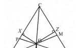
Of course, when talking about composition, one cannot fail to mention the rule of thirds. By drawing four lines in your mind through the frame - two dividing it into three equal parts horizontally, and two drawn vertically - you can calculate the most effective areas of the frame: they are at the intersection points of the four lines with each other. In these zones it is best to place the main object of the composition.
In fact, the rule of thirds is a simplified rule of the golden ratio, which will be somewhat more difficult to obtain. To do this, the frame must be divided into eight parts horizontally and vertically. And then draw from the right and left, as well as from below and above, lines at a distance of 3/8. At the intersection of these lines, there will be points of the golden section. But the division into three parts is much more convenient than into eight parts, so it is used more often in the composition: the difference is not so noticeable to the viewer, and the harmony in the frame, subject to any of these rules, is obvious.
Rhythm
 |
 |
Rhythm, that is, the repetition of the same or similar lines, is a very powerful compositional tool that allows you to manipulate the viewer's gaze. On the "path" of alternating objects can be taken very far. But don't overdo it - the rhythm can kill the whole composition, depriving it of dynamics and making it monotonous.
Internal communications
When creating a production for photography, it is necessary to ensure that there is a connection between objects in the frame. Objects can be connected by shape (egg and onion), by color (tomato and red pepper), by meaning (apple and cinnamon sticks). Objects must necessarily communicate, captivate the viewer, shifting his gaze from one object in a still life to another. This approach gives integrity to the composition, makes it interesting, understandable and at the same time mysterious - it is not at all necessary to reveal all the internal connections at once, the most interesting can be hidden inside the composition or briefly hidden from the viewer, for example, with light.
One can talk about composition endlessly, but the main thing on which a still life is built (as, indeed, photography in any other genre) is the idea, plot and soul of the picture. And the composition is the same tool in the hands of the photographer as the camera itself. Remember what you want to convey to the viewer! And use all the available compositional techniques for your own purposes.
Chess stylization of a still life. Master class with photo
Elena Alekseevna Nadeenskaya, teacher of fine arts, Arsenyevskaya secondary school, Arsenyevo village, Tula region.Description: the material will be of interest to fine art teachers, educators, teachers of additional education, creative children aged 10-12.
Purpose: use in art classes, the work can serve as an interior decoration, an excellent gift or an exhibition piece.
Target: performing a still life using division of the image into parts (cells)
Tasks:
- to acquaint with a variety of techniques of the decorative image of a still life;
- develop a sense of composition, imagination, develop creative abilities;
- improve the skills of working with gouache; exercise in the ability to work with a brush of various sizes in accordance with the task,
- educate interest in the basics of visual literacy.
- to cultivate accuracy, love for fine art.
Materials:
- black gouache (you can use ink)
- brushes No. 2, No. 5
-pencil
-ruler
-eraser
- A3 sheet

Still life- This is a genre of fine art dedicated to depicting household items, fruits, vegetables, flowers, etc.
As an independent genre, still life was developed in the 17th century. in the work of Dutch artists. And at present, the genre is quite widely used by contemporary artists and designers. Along with a realistic image, you can often come across the concept of "decorative still life".
A decorative still life is characterized by a conditional, simplified representation of forms, stylization.
A lot of attention is paid to the color solution, color - the color combination used in the composition. The use of contrasting colors is common. The most harmonious contrasting combination is the ratio of black and white. This combination is actively used in graphics, clothes, interiors, etc.
We will try to perform our today's still life composition using a combination of black and white, but to the color, we will also add the concept of dividing the plane into parts - cells. Let's remember the location of the color cells-fields on the chessboard, note that the same-colored fields are never united by a common side, they touch each other only at one point. We will try to use this feature in the work on the composition of the still life.

Working process
1. Having thought over the composition, we choose the location of the sheet. We plan the location of objects. If you are working in this technique for the first time, try not to complicate the composition by superimposing the shape of one object on another.

2. We outline the design of objects with broken lines. Since the still life will be decorative, there is no need to strive to convey volume, a planar construction will suffice.

3. We refine the contours of the shape of objects. We outline the contours of the vase, cup with smoother lines, draw the stems of flowers, fruits. Delete construction lines.

4. We outline the falling shadows. We divide the plane of the sheet into cells of the same size using a ruler. The optimal cell size for a landscape sheet (A4) is 3 cm, if the sheet is larger (A3), then the length of the side of the cell can be increased to 5 cm. If there is no experience in such a still life image, try not to complicate the task by reducing the size of the cells.

5. We start painting the cells with black gouache. We try to take a thick paint so that the paint layer is sufficiently dense and uniform. If the shape of objects falls within the cage, then we leave it unpainted. It is better to start working from the extreme cells, gradually moving into the middle of the composition.

6. Let's move on to painting the cells in the middle of the composition, without going beyond the contours of the objects.

7. After completing the coloring of the background, we begin to work out the color of the parts of the objects that fell on the white cells.

8. Continuing to work on the coloring of individual elements, we are approaching the completion of work. We refine the lines of the shape of objects, correct inaccuracies and sloppy contours of cells.

The work is ready.

Thank you for your attention! I wish you all creative success!
A black and white still life can be painted in a variety of ways. It can look like a standard pencil sketch or an interesting illustration of spots or letters. Today we will talk about different techniques that you can easily repeat at home.
Spotted pattern
Black and white still life is most often done decorative. Why? Yes, because he looks so good. A realistic image, devoid of color, may look appropriate if it is a portrait, illustration, or something similar, with many details. A realistic still life is not very interesting to consider. Therefore, many artists prefer decorative works. Still life black and white is drawn very simply. First you need to build a composition. You can draw from nature, which will be easier, or come up with a setting in your imagination. In our case, there is a jug and a bowl of apples on the table. A bow and drapery hang on the wall. When all this has been found a suitable place on the sheet, and the details have been worked out, you can proceed to dividing the objects into parts. Moreover, this should be done not in a chaotic manner, but clearly thinking through so that the white parts are adjacent to the black ones and not one of the objects is lost.
line drawing
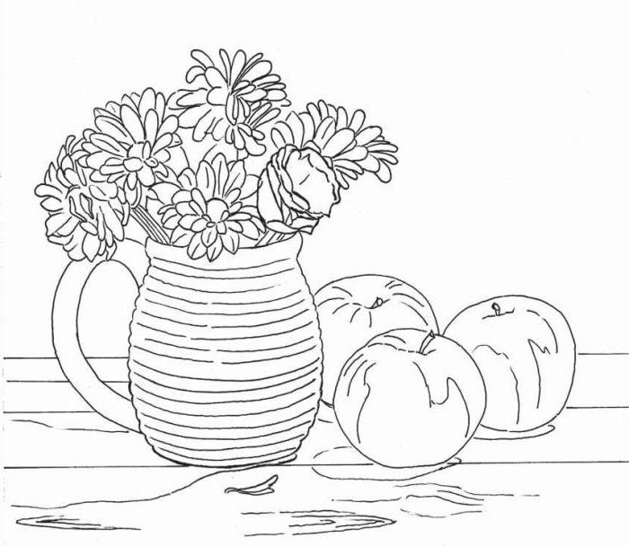
Still life black and white can be painted in various techniques. One of them is the image of a drawing using lines. To draw such a picture, you need to take objects that have a clearly defined texture. If this is not the case, then the relief will have to be invented. You need to start drawing a black and white still life by building a composition. First, we outline all the items. In our case, this is a mug with flowers, apples and a wooden table. After all the items have taken their place, we begin to work out the shape, and then the details. The final action is the image of the texture. The mug acquires horizontal stripes, flowers and apples - a cut-off border. Be sure to show the texture of the table. It is advisable to combine horizontal and vertical lines in a still life so that the objects do not merge, but stand out against each other.
Drawing from letters

This image will look like a black and white graphic. The still life consists of letters that smoothly turn into words and even sentences. How to draw such an original decorative composition? First you need to draw a sketch. Outline the cup and the newspaper that will lie in the background. After that, you need to divide the drawing by tones. For example, coffee in a mug should be the most saturated in tone, the second place is occupied by a falling shadow, and the third is your own. Thus, it is possible to divide the entire sketch with lines. After that, if you are confident in your abilities, you can paint over the drawing with a gel pen, and if you are worried that something will not work out, first make an underpainting of the letters with a pencil. True, in this case, the letters will have to be circled with ink. The gel pen does not draw well with a pencil. The letters should be superimposed according to the shape of the objects. And be sure to play with height and width. One word may be very narrow, and another two or three times as large. You can encrypt some phrases in such a picture, or you can write arbitrary words.
Students perform decorative still life in an art school according to the following methodology:
1. Arrangement of objects in a sheet.
2. Transformation (form stylization).
3. Overlay or braiding of silhouettes with each other.
4. Filling silhouettes with texture and decorative solutions.

As you know, a still life is a production of inanimate objects. In easel painting, still lifes are painted traditionally: they sculpt the volume of objects, convey chiaroscuro, linear and aerial perspective, space ... In a decorative still life, this becomes unimportant. The form of the depicted objects becomes flat and conditional. Chiaroscuro is absent. Instead, each silhouette is worked out decoratively.

On the transformation of the form you need to stop separately. Its essence lies in the transformation of the original form of the object into a conditional one. That is, the drawing is simplified, deprived of unnecessary details. The form is reduced to a conditionally geometric one, that is, it is based on simple geometric shapes (circle, rectangle, triangle ...). For example, a jug can be made up of a circle and a cylinder, and top and bottom can be completed with circles or ellipses. Thus, only the character of the object remains. He must be recognizable. And the contours will already be transformed and brought to a common style.

Overlapping or braiding silhouettes is a technique in decorative art and design. The imposition of silhouettes on each other is understandable by definition - this is when objects obscure each other and the image becomes, as it were, multi-layered. But the weaving is more complicated. For example, when a part of a jar is obscured by an apple, then the intersecting parts of the jug and the apple can be displayed by the artist in a completely different color. Objects become as if "transparent" and their intersecting parts are visible to the viewer. The silhouettes of objects are intertwined in such an intricate way that in the end, it is sometimes difficult to distinguish them. And this gives the decorative work a special appeal.

Filling the contours of objects with a texture- is not particularly difficult. You can spray paint, you can lay paint with chaotic strokes, etc. But filling the silhouette with a decorative solution is more difficult. The artist comes up with a kind of “ornament”, although this word is not quite suitable here. With this "ornament" he fills the silhouette. This “ornament” is created on the basis of the generatrix. A forming line is a line that forms the outline of an object. For example, the contour of a Greek amphora will be gracefully curved. Therefore, the interior decoration of the silhouette will be based on curved lines in a similar way. Separate parts of such decoration of objects, as well as the objects themselves, can be braided. Also, between them you can skip the literal ornament. Therefore, such decoration is not just filling silhouettes with only texture or coloring. This is a more complex process. But also more spectacular, on which the essence of a decorative still life is based.
Still life photographs are known to be quite common. Often, many photographers like to present their still lifes in black and white. To do this, you need to find objects, compare everyday objects in your environment, and also enhance the difference in textures and tones. Converting to black and white gives you a lot of options when viewing the photo itself.
Black and white still life allows you to focus on the lines of photography, textures and forms. In this case, it is much easier to focus on these elements, since there is no need to be distracted by colors. Good use of this technique will allow not only to obtain a more objective image in terms of its integrity, but also to increase the tension between various objects and materials. Such combinations can be found everywhere, for example, in the park, on the beach, etc. You can take pictures of any objects. In addition, you can photograph objects in pairs, or in larger numbers. It should be noted that it is not recommended to apply the same methods of converting a photo to black and white.